
Locating the toolbar code in the Grida codebase.
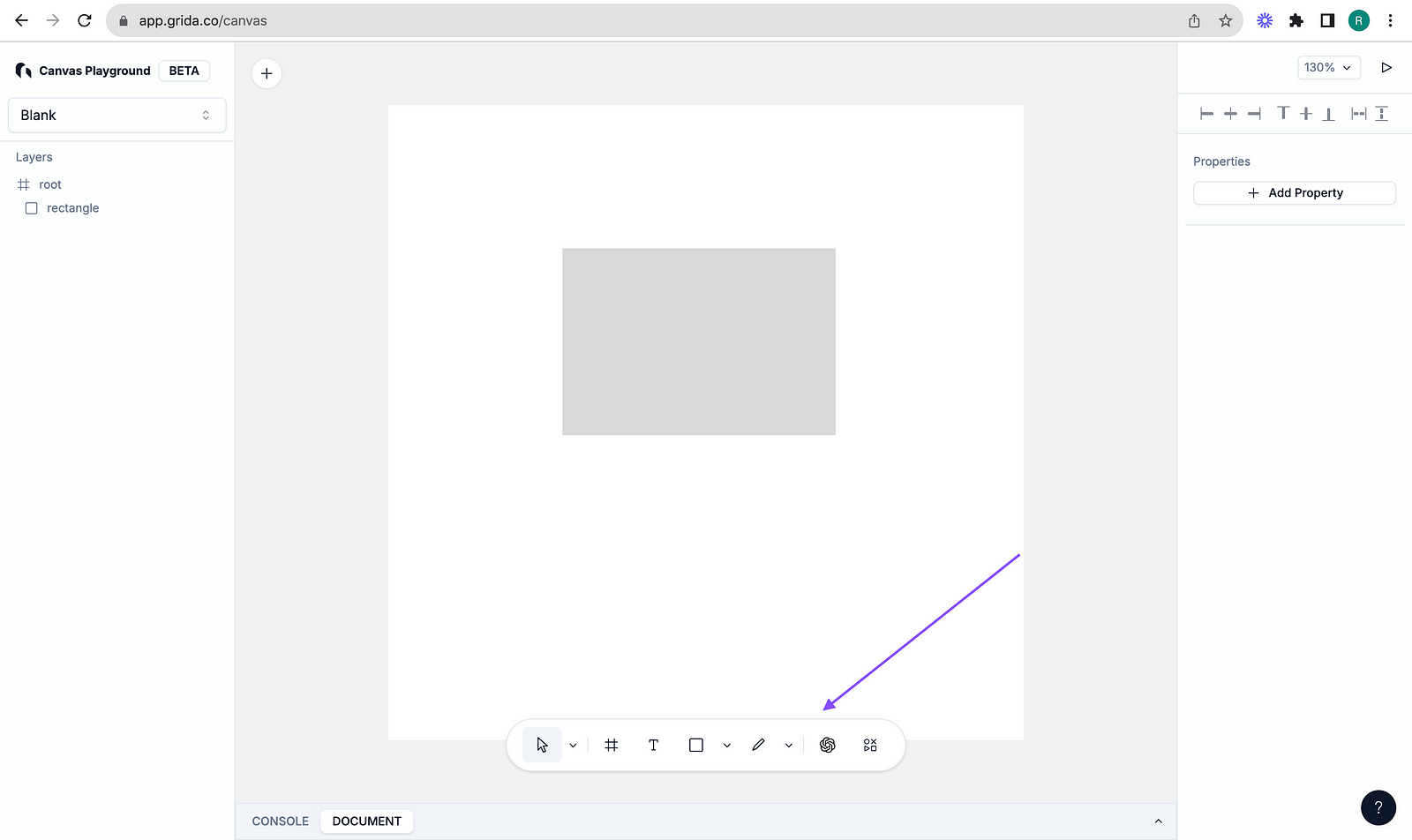
In this article, we will review the code related to toolbar that you find on Grida Canvas page. I will describe the approach I have taken to find the code rendering this toolbar shown in the below image.
Inspect and find a unique identifier
When I want to locate the code for an element in a project, I tend to open the developer tools and inspect the element, which in this case is toolbar.
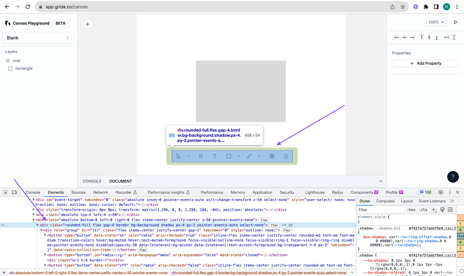
The unique identifier here I chose is the classname.
rounded-full flex gap-4 border bg-background shadow px-4 py-2 pointer-events-auto select-none
I searched across the codebase for this classname in the hopes of finding the toolbar component.
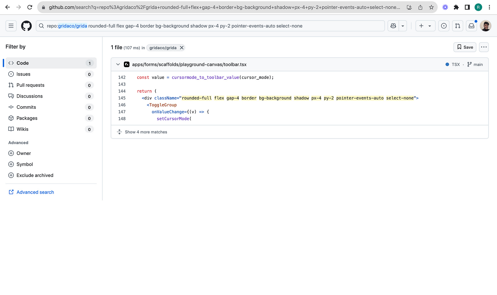
There it was, toolbar.tsx. PlaygroundToolbar.tsx has the below code
export function PlaygroundToolbar({
  onAddButtonClick,
}: {
  onAddButtonClick?: () => void;
}) {
  const { setCursorMode, cursor_mode } = useEventTarget();

  const value = cursormode_to_toolbar_value(cursor_mode);

  return (
    <div className="rounded-full flex gap-4 border bg-background shadow px-4 py-2 pointer-events-auto select-none">
      <ToggleGroup
        onValueChange={(v) => {
          setCursorMode(
            v
              ? toolbar_value_to_cursormode(v as ToolbarToolType)
              : { type: "cursor" }
          );
        }}
        value={value}
        defaultValue="cursor"
        type="single"
      >
        <ToolsGroup
          value={value}
          options={[
            { value: "cursor", label: "Cursor", shortcut: "V" },
            { value: "hand", label: "Hand tool", shortcut: "H" },
          ]}
          onValueChange={(v) => {
            setCursorMode(toolbar_value_to_cursormode(v as ToolbarToolType));
          }}
        />
        <VerticalDivider />
        <ToggleGroupItem value={"container" satisfies ToolbarToolType}>
          <FrameIcon />
        </ToggleGroupItem>
        <ToggleGroupItem value={"text" satisfies ToolbarToolType}>
          <ToolIcon type="text" />
        </ToggleGroupItem>
        <ToolsGroup
          value={value}
          options={[
            { value: "rectangle", label: "Rectangle", shortcut: "R" },
            { value: "ellipse", label: "Ellipse", shortcut: "O" },
            { value: "line", label: "Line", shortcut: "L" },
            { value: "image", label: "Image" },
          ]}
          onValueChange={(v) => {
            setCursorMode(toolbar_value_to_cursormode(v as ToolbarToolType));
          }}
        />
        <ToolsGroup
          value={value}
          options={[
            { value: "pencil", label: "Pencil tool", shortcut: "⇧+P" },
            { value: "path", label: "Path tool", shortcut: "P" },
          ]}
          onValueChange={(v) => {
            setCursorMode(toolbar_value_to_cursormode(v as ToolbarToolType));
          }}
        />

        <VerticalDivider />
        <Popover>
          <PopoverTrigger asChild>
            <Button variant="ghost" className="px-3">
              <OpenAILogo className="w-4 h-4" />
            </Button>
          </PopoverTrigger>
          <PopoverContent
            side="top"
            sideOffset={16}
            align="end"
            className="w-96"
          >
            <Generate />
          </PopoverContent>
        </Popover>
        <Button variant="ghost" className="px-3" onClick={onAddButtonClick}>
          <MixIcon />
        </Button>
      </ToggleGroup>
    </div>
  );
}

At this point, I would check where this component is used. It is found to be at line 417 in playground.tsx.
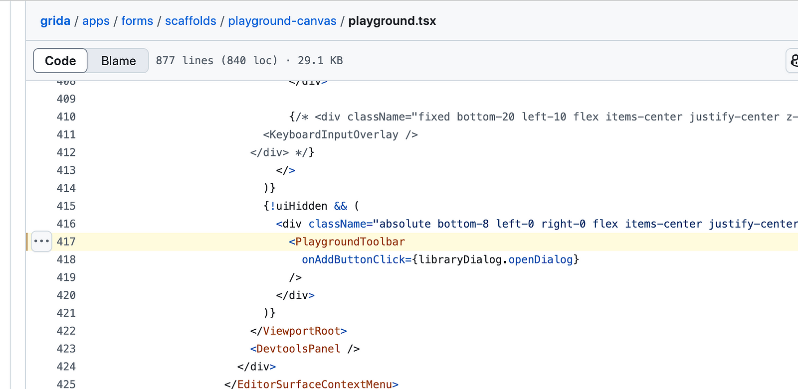
{!uiHidden && (
  <div className="absolute bottom-8 left-0 right-0 flex items-center justify-center z-50 pointer-events-none">
    <PlaygroundToolbar
      onAddButtonClick={libraryDialog.openDialog}
    />
  </div>
)}
So far, we just located the toolbar code. We need to understand what happens when you click on a toolbar item. setCursorMode is found to be called. This will lead us to understand how the canvas state is managed.
About me:
Hey, my name is Ramu Narasinga. I study large open-source projects and create content about their codebase architecture and best practices, sharing it through articles, videos.
I am open to work on interesting projects. Send me an email at ramu.narasinga@gmail.com
My Github — https://github.com/ramu-narasinga
My website — https://ramunarasinga.com
My Youtube channel — https://www.youtube.com/@thinkthroo
Learning platform — https://thinkthroo.com
Codebase Architecture — https://app.thinkthroo.com/architecture
Best practices — https://app.thinkthroo.com/best-practices
Production-grade projects — https://app.thinkthroo.com/production-grade-projects