
shadcn-ui/ui codebase analysis: Dashboard example explained.
In this article, we will learn about Dashboard example in shadcn-ui/ui. This article consists of the following sections:
-
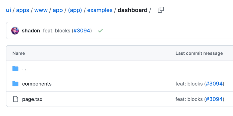
Where is dashboard folder located?
-
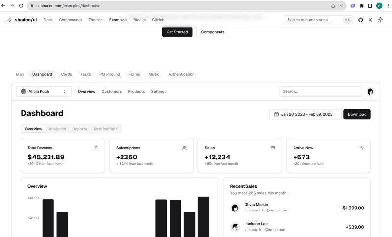
What is in dashboard folder?
-
Components used in dashboard example.
Where is dashboard folder located?
Shadcn-ui/ui uses app router and dashboard folder is located in examples folder, which is located in (app), a route group in Next.js.

What is in dashboard folder?
As you can see from the above image, we have components folder, page.tsx.
page.tsx is loaded in place of children in examples/layout.tsx.
Below is the code picked from mail/page.tsx
import { Metadata } from "next"
import Image from "next/image"

import { Button } from "@/registry/new-york/ui/button"
import {
  Card,
  CardContent,
  CardDescription,
  CardHeader,
  CardTitle,
} from "@/registry/new-york/ui/card"
import {
  Tabs,
  TabsContent,
  TabsList,
  TabsTrigger,
} from "@/registry/new-york/ui/tabs"
import { CalendarDateRangePicker } from "@/app/(app)/examples/dashboard/components/date-range-picker"
import { MainNav } from "@/app/(app)/examples/dashboard/components/main-nav"
import { Overview } from "@/app/(app)/examples/dashboard/components/overview"
import { RecentSales } from "@/app/(app)/examples/dashboard/components/recent-sales"
import { Search } from "@/app/(app)/examples/dashboard/components/search"
import TeamSwitcher from "@/app/(app)/examples/dashboard/components/team-switcher"
import { UserNav } from "@/app/(app)/examples/dashboard/components/user-nav"

export const metadata: Metadata = {
  title: "Dashboard",
  description: "Example dashboard app built using the components.",
}

export default function DashboardPage() {
  return (
    <>
      <div className="md:hidden">
        <Image
          src="/examples/dashboard-light.png"
          width={1280}
          height={866}
          alt="Dashboard"
          className="block dark:hidden"
        />
        <Image
          src="/examples/dashboard-dark.png"
          width={1280}
          height={866}
          alt="Dashboard"
          className="hidden dark:block"
        />
      </div>
      <div className="hidden flex-col md:flex">
        <div className="border-b">
          <div className="flex h-16 items-center px-4">
            <TeamSwitcher />
            <MainNav className="mx-6" />
            <div className="ml-auto flex items-center space-x-4">
              <Search />
              <UserNav />
            </div>
          </div>
        </div>
        <div className="flex-1 space-y-4 p-8 pt-6">
          <div className="flex items-center justify-between space-y-2">
            <h2 className="text-3xl font-bold tracking-tight">Dashboard</h2>
            <div className="flex items-center space-x-2">
              <CalendarDateRangePicker />
              <Button>Download</Button>
            </div>
          </div>
          <Tabs defaultValue="overview" className="space-y-4">
            <TabsList>
              <TabsTrigger value="overview">Overview</TabsTrigger>
              <TabsTrigger value="analytics" disabled>
                Analytics
              </TabsTrigger>
              <TabsTrigger value="reports" disabled>
                Reports
              </TabsTrigger>
              <TabsTrigger value="notifications" disabled>
                Notifications
              </TabsTrigger>
            </TabsList>
            <TabsContent value="overview" className="space-y-4">
              <div className="grid gap-4 md:grid-cols-2 lg:grid-cols-4">
                <Card>
                  <CardHeader className="flex flex-row items-center justify-between space-y-0 pb-2">
                    <CardTitle className="text-sm font-medium">
                      Total Revenue
                    </CardTitle>
                    <svg
                      xmlns="http://www.w3.org/2000/svg"
                      viewBox="0 0 24 24"
                      fill="none"
                      stroke="currentColor"
                      strokeLinecap="round"
                      strokeLinejoin="round"
                      strokeWidth="2"
                      className="h-4 w-4 text-muted-foreground"
                    >
                      <path d="M12 2v20M17 5H9.5a3.5 3.5 0 0 0 0 7h5a3.5 3.5 0 0 1 0 7H6" />
                    </svg>
                  </CardHeader>
                  <CardContent>
                    <div className="text-2xl font-bold">$45,231.89</div>
                    <p className="text-xs text-muted-foreground">
                      +20.1% from last month
                    </p>
                  </CardContent>
                </Card>
                <Card>
                  <CardHeader className="flex flex-row items-center justify-between space-y-0 pb-2">
                    <CardTitle className="text-sm font-medium">
                      Subscriptions
                    </CardTitle>
                    <svg
                      xmlns="http://www.w3.org/2000/svg"
                      viewBox="0 0 24 24"
                      fill="none"
                      stroke="currentColor"
                      strokeLinecap="round"
                      strokeLinejoin="round"
                      strokeWidth="2"
                      className="h-4 w-4 text-muted-foreground"
                    >
                      <path d="M16 21v-2a4 4 0 0 0-4-4H6a4 4 0 0 0-4 4v2" />
                      <circle cx="9" cy="7" r="4" />
                      <path d="M22 21v-2a4 4 0 0 0-3-3.87M16 3.13a4 4 0 0 1 0 7.75" />
                    </svg>
                  </CardHeader>
                  <CardContent>
                    <div className="text-2xl font-bold">+2350</div>
                    <p className="text-xs text-muted-foreground">
                      +180.1% from last month
                    </p>
                  </CardContent>
                </Card>
                <Card>
                  <CardHeader className="flex flex-row items-center justify-between space-y-0 pb-2">
                    <CardTitle className="text-sm font-medium">Sales</CardTitle>
                    <svg
                      xmlns="http://www.w3.org/2000/svg"
                      viewBox="0 0 24 24"
                      fill="none"
                      stroke="currentColor"
                      strokeLinecap="round"
                      strokeLinejoin="round"
                      strokeWidth="2"
                      className="h-4 w-4 text-muted-foreground"
                    >
                      <rect width="20" height="14" x="2" y="5" rx="2" />
                      <path d="M2 10h20" />
                    </svg>
                  </CardHeader>
                  <CardContent>
                    <div className="text-2xl font-bold">+12,234</div>
                    <p className="text-xs text-muted-foreground">
                      +19% from last month
                    </p>
                  </CardContent>
                </Card>
                <Card>
                  <CardHeader className="flex flex-row items-center justify-between space-y-0 pb-2">
                    <CardTitle className="text-sm font-medium">
                      Active Now
                    </CardTitle>
                    <svg
                      xmlns="http://www.w3.org/2000/svg"
                      viewBox="0 0 24 24"
                      fill="none"
                      stroke="currentColor"
                      strokeLinecap="round"
                      strokeLinejoin="round"
                      strokeWidth="2"
                      className="h-4 w-4 text-muted-foreground"
                    >
                      <path d="M22 12h-4l-3 9L9 3l-3 9H2" />
                    </svg>
                  </CardHeader>
                  <CardContent>
                    <div className="text-2xl font-bold">+573</div>
                    <p className="text-xs text-muted-foreground">
                      +201 since last hour
                    </p>
                  </CardContent>
                </Card>
              </div>
              <div className="grid gap-4 md:grid-cols-2 lg:grid-cols-7">
                <Card className="col-span-4">
                  <CardHeader>
                    <CardTitle>Overview</CardTitle>
                  </CardHeader>
                  <CardContent className="pl-2">
                    <Overview />
                  </CardContent>
                </Card>
                <Card className="col-span-3">
                  <CardHeader>
                    <CardTitle>Recent Sales</CardTitle>
                    <CardDescription>
                      You made 265 sales this month.
                    </CardDescription>
                  </CardHeader>
                  <CardContent>
                    <RecentSales />
                  </CardContent>
                </Card>
              </div>
            </TabsContent>
          </Tabs>
        </div>
      </div>
    </>
  )
}
Components used in dashboard example.
To find out the components used in this dashboard example, we can simply look at the imports used at the top of page.
import { Button } from "@/registry/new-york/ui/button"
import {
  Card,
  CardContent,
  CardDescription,
  CardHeader,
  CardTitle,
} from "@/registry/new-york/ui/card"
import {
  Tabs,
  TabsContent,
  TabsList,
  TabsTrigger,
} from "@/registry/new-york/ui/tabs"
import { CalendarDateRangePicker } from "@/app/(app)/examples/dashboard/components/date-range-picker"
import { MainNav } from "@/app/(app)/examples/dashboard/components/main-nav"
import { Overview } from "@/app/(app)/examples/dashboard/components/overview"
import { RecentSales } from "@/app/(app)/examples/dashboard/components/recent-sales"
import { Search } from "@/app/(app)/examples/dashboard/components/search"
import TeamSwitcher from "@/app/(app)/examples/dashboard/components/team-switcher"
import { UserNav } from "@/app/(app)/examples/dashboard/components/user-nav"
Do not forget the modular components inside dashboard folder.
Want to learn how to build shadcn-ui/ui from scratch? Check out build-from-scratch and give it a star if you like it. Solve challenges to build shadcn-ui/ui from scratch. If you are stuck or need help? solution is available.
About me:
Hey, my name is Ramu Narasinga. Email: ramu.narasinga@gmail.com
Tired of AI-generated code that works but nobody understands?
I spent 3+ years studying OSS codebases and wrote 350+ articles on what makes them production-grade. I built an open source tool that reviews your PR against your existing codebase patterns.
Your codebase. Your patterns. Enforced.