Shadcn-ui codebase analysis: Perfect Next.js dark mode in 2 lines of code with next-themes.
So I wanted to figure out how ui.shadcn.com implemented dark mode on their website. I looked at its source code. These things usually lie in providers.
That is when I came across next-themes. You can easily add dark mode to your next.js app using next-themes. In this article, you will learn the below concepts:
How to configure next-themes in Next.js?
How is next-themes configured in shadcn-ui/ui?
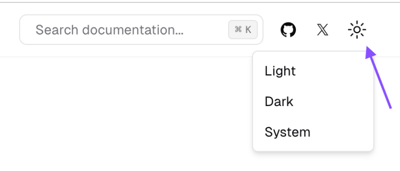
useTheme to toggle dark/light modes.
How is useTheme written in shadcn-ui/ui?
Want to learn how to build shadcn-ui/ui from scratch? Check outbuild-from-scratchand give it a star if you like it. Sovle challenges to build shadcn-ui/ui from scratch. If you are stuck or need help?there is a solution.
You’ll need to update your app/layout.jsx to use next-themes. The simplest layout looks like this:
// app/layout.jsxexport default function Layout({ children }) { return ( <html> <head /> <body>{children}</body> </html> )}
Adding dark mode support takes 2 lines of code:
// app/layout.jsximport { ThemeProvider } from 'next-themes'export default function Layout({ children }) { return ( <html suppressHydrationWarning> <head /> <body> <ThemeProvider>{children}</ThemeProvider> </body> </html> )}
Note that ThemeProvider is a client component, not a server component.
Note! If you do not addsuppressHydrationWarningto youryou will get warnings because next-themes updates that element. This property only applies one level deep, so it won't block hydration warnings on other elements.
The answer is in Layout.tsx, it has a ThemeProvider imported from @/components/providers.tsx. Shadcn-ui/ui follows the same configuration provided in the official documentation, except for few properties. They are shown in the image below:
attribute = 'data-theme': HTML attribute modified based on the active theme, accepts class and data-* (meaning any data attribute, data-mode, data-color, etc.) (example)
defaultTheme = 'system': Default theme name (for v0.0.12 and lower the default was light). If enableSystem is false, the default theme is light
enableSystem = true: Whether to switch between dark and light based on prefers-color-scheme
disableTransitionOnChange = false: Optionally disable all CSS transitions when switching themes (example)
Your UI will need to know the current theme and be able to change it. The useTheme hook provides theme information:
import { useTheme } from 'next-themes'const ThemeChanger = () => { const { theme, setTheme } = useTheme() return ( <div> The current theme is: {theme} <button onClick={() => setTheme('light')}>Light Mode</button> <button onClick={() => setTheme('dark')}>Dark Mode</button> </div> )}
Warning! The above code is hydration unsafe and will throw a hydration mismatch warning when rendering with SSG or SSR. This is because we cannot know the theme on the server, so it will always be undefined until mounted on the client.
This approach seems quite straight forward, except for few additional properties passed into ThemeProvider in shadcn/ui. You need to first configure the ThemeProvider and then use the useTheme hook to switch dark/light modes.
Hey, my name is Ramu Narasinga. I study large open-source projects and create content about their codebase architecture and best practices, sharing it through articles, videos.